
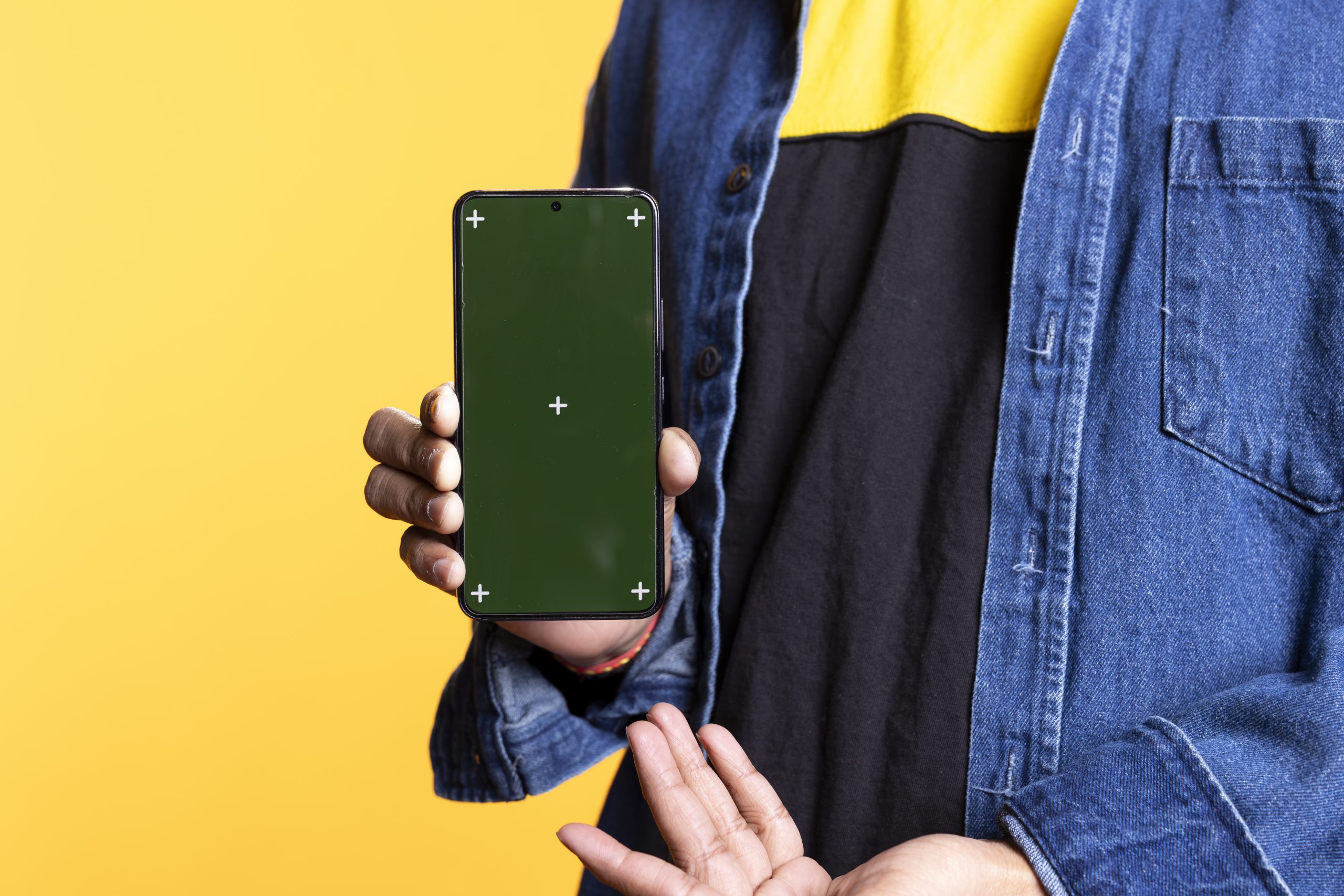
The way designers present apps and digital products has quietly transformed over the past year. What used to be a simple flat screenshot dropped into a frame has become a full visual language — one that studios, indie developers, and marketing teams rely on to make their work look credible before a single line of code is judged. In 2026, this shift is no longer optional. Clients expect polish, and polish starts with how the product is shown.
Content Summary
From Flat Frames to Contextual Storytelling
The biggest change this year is context. A bare device outline on a white background no longer cuts it for App Store listings, Product Hunt launches, or investor decks. Designers now build scenes: a phone resting on a desk next to a coffee cup, held mid-scroll in natural light, or angled against a textured backdrop that matches a brand’s palette.
This isn’t decoration for its own sake — it mirrors how real users actually encounter apps, which makes the presentation feel trustworthy rather than staged.
A well-composed mockup doesn’t just show a screen — it shows a moment. And moments get remembered longer than interfaces do.
Teams launching on Product Hunt, for instance, routinely swap generic screenshots for framed, lifestyle-style shots because listings with richer visuals tend to hold attention longer in a feed full of competing launches. The same logic applies to Instagram and LinkedIn posts announcing a new feature — a well-composed mockup gets more engagement than a raw screen capture.
Precision Over Genericism
Another shift is away from one-size-fits-all templates. In 2026, buyers are pickier about device accuracy — correct bezel proportions, true-to-life shadows, and realistic screen reflections matter more than before, especially as more products get compared side-by-side in comparison articles and review roundups.
A distorted or outdated device shape is an easy way to make an otherwise strong app look unfinished — and it’s often the first thing an experienced eye notices.
This is where tools like Phone mockup resources have found steady demand — designers want files that already reflect current device generations and can be dropped into Figma or Sketch without hours of manual perspective correction. Studios producing case studies for their portfolios use these assets to keep every project looking consistent, which matters when a potential client is scrolling through a Behance or Dribbble profile comparing multiple shots at once.
Where Mockups Actually Get Used
It helps to look at where these assets show up in real workflows, not just in theory:
- App Store and Google Play listings — screenshots framed in a device outline consistently outperform bare screen grabs in click-through
- Kickstarter and Indiegogo campaign pages — a product’s interface needs to look tangible to non-technical backers
- Pitch decks — founders present an MVP before it’s fully built, using a mockup to simulate a “finished” feel
- Case studies on agency websites — consistency across dozens of project thumbnails signals professionalism
- Social media ads — a phone-in-hand composition performs better than a flat UI crop because it reads faster as “a real app people use”
Each of these contexts asks for something slightly different — a Kickstarter page benefits from warmth and human presence, while a portfolio case study benefits from clean, repeatable framing. That’s part of why generic single-angle mockups are losing ground to flexible packs offering multiple scenes and angles.
Motion, Depth, and the Rise of Animated Mockups
Static images are increasingly paired with short looping animations and 3D-rendered scenes, especially on landing pages and Product Hunt galleries, where a subtle tilt or parallax effect adds perceived production value without needing a video team.
The appeal is practical: a phone tilting under changing light, or a screen auto-scrolling through a feed, holds attention far longer than a static hero image — which is why more agencies now budget for motion even on modest launches.
A two-second loop that makes a screen feel “alive” often does more for perceived credibility than a fully rendered 3D scene.
This also tracks with where content actually gets consumed — Reels, TikTok, and App Store preview videos all reward movement over stillness, pushing teams to treat a mockup as a short sequence rather than one static frame.
Animated formats tend to work best as a layer on top of solid static assets rather than a replacement for them:
- 3D-rendered device scenes — used for hero sections and pitch decks where depth and realistic lighting matter more than motion itself
- Looping micro-animations — short, GIF-like or Lottie-based loops embedded directly in landing pages or App Store galleries
- Scroll-triggered parallax — the device appears to shift or tilt as the visitor scrolls down a page, adding a layer of interactivity without full video production
- Auto-scrolling screen content — simulates a user actually browsing the app, which is especially common in App Store preview clips
Motion is usually built on top of a well-composed mockup, not instead of one.
What Actually Drives Purchase Decisions
Even as animation and 3D scenes get more attention, the workhorse of the industry remains the layered PSD or Figma file — something a designer can open, drop a screenshot into a smart layer, and export in minutes. Speed hasn’t stopped mattering just because expectations have risen; if anything, faster turnaround with higher visual quality is exactly what agencies are optimizing for under tight client deadlines.
A few practical factors are now driving how teams choose mockup resources:
- Editable lighting and background colors that match a brand’s palette without sourcing new stock photography
- Multiple device angles included in a single pack, instead of buying separate files per shot
- Smart-object layers that update instantly across dozens of exported images
- Compatibility with existing tools — files that drop straight into Figma or Photoshop without conversion headaches
Color accuracy has also become a quiet differentiator. As brands lean into specific palettes for launches, mockup packs that allow easy background and lighting adjustments save real production time compared to sourcing separate stock photography for every campaign.
Choosing Assets That Keep Up
For teams building out a design system or preparing a product launch, the practical takeaway is this: pick mockup resources built for how they’ll actually be used, not just how they look in a preview thumbnail. Studios such as ls.graphics have built a reputation around exactly this kind of flexibility — current device shapes, editable scenes, and files that fit into an existing design workflow rather than fighting against it.
Ultimately, phone mockup trends in 2026 aren’t about chasing a flashy aesthetic — they’re about closing the gap between how a product looks in a pitch and how it will actually feel in someone’s hand. The teams getting the best results are the ones treating presentation as part of the product experience itself, not an afterthought tacked on right before launch.